
Big enough for the shelf.
What the roaster needed before going wholesale.
Ember & Oak had built a loyal following at weekend markets with a hand-stamped logo and brown paper bags. Wholesale changed that: the coffee now had to stand out on café shelves next to well-known brands.
The brief was to grow up without losing the hand-made warmth that won them their first customers.
A mark that scales
From a cup sleeve to a café awning, without losing the hand-made feel.
Packaging that sorts itself
Roast level and origin readable from across the counter.
A site for cafés
Wholesale enquiries, brew guides and a subscription, all in one place.
From stamp to system.
Drag to compare the market-stall bag with the new range.

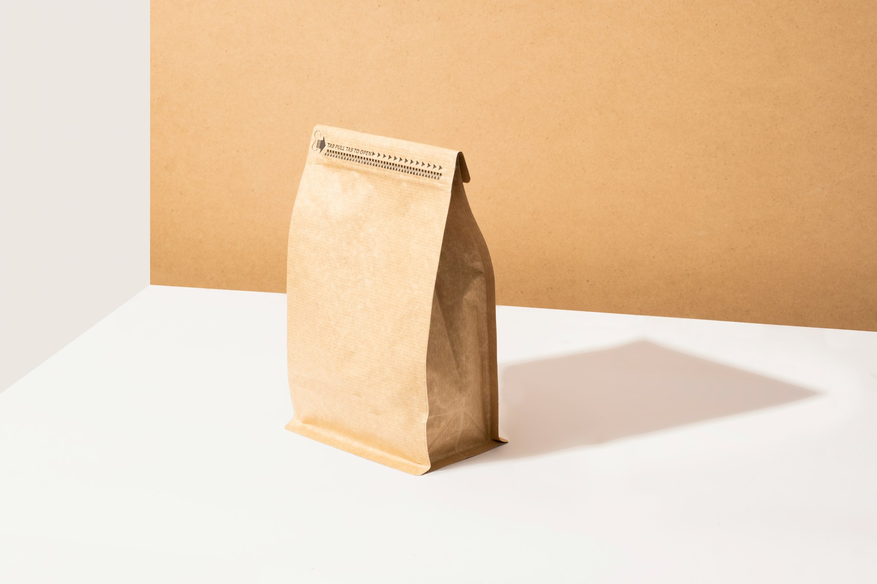
We kept the stamp and turned it into a system. The original mark was redrawn, and its rough edge became the frame for every label.
Colour does the sorting.
One colour per roast, so baristas never have to read the small print.
Each roast level got its own colour, from pale oat to deep ember, set against the kraft paper the roaster already loved. Origin, process and tasting notes sit in a fixed grid on the back, so each new coffee only needs a new colour and new words.
The website uses the same colours, so the brew guides and the subscription page look like the bags on the shelf.

Five roast colours on kraft paper, with one shared label grid.


The same roast colours carry through from café signage to brew guides on the site.
What it adds up to.
Sales figures from the first six months of wholesale.
Ember & Oak now supplies 24 cafés, up from 3, and their online subscriptions have grown every month since launch. The same label grid has held up through eleven new coffees.
“Cafés ask for us by colour now. That never happened with the old bags.”
Head Roaster · Ember & Oak
Visit the site ↗